

Wellmify – Registration Flow Redesign
Client
Wellmify
product
Mobile App
Industry
Beauty
time
2025
Overview
This project focused on redesigning the registration process in the service provider app, which plays a critical role in user activation. The existing flow caused a high drop-off rate and led to a significant number of incorrect registrations by end customers instead of service providers.
The goal of the redesign was to create a clear, efficient, and role-specific registration experience that helps the right users successfully complete sign-up, understand the value of the provider app, and start using Wellmify with confidence.
Client
Wellmify is a platform consisting of two connected mobile applications that link beauty service providers with their clients, enabling direct booking with providers. One of the most critical touchpoints for the provider-side app is the registration process, which directly impacts activation, data quality, and the first impression of the product.
Problem
Data analysis and stakeholder feedback revealed several critical issues in the service provider registration flow:
a high percentage of users dropped off during registration,
the process was perceived as too long and unclear,
a significant number of end customers registered instead of service providers, leading to low-quality accounts and additional operational costs.

Project Goals
Increase registration completion rate for service providers
Clearly distinguish between service providers and clients. Ensure higher-quality provider accounts
Improve clarity and perceived value of the provider app from the first interaction
Research Process
Methods
Audit of the existing registration flow (heuristics, WCAG)
Data and funnel analysis
Competitive benchmarking
User interviews
Old Welcome Screen – examples of detected issuues

New Welcome Screen
Focus on the value proposition
Buttons - highlighted on primary action
Adding button sending to download client app - for lost users
👍🏽 24% of users click in ,,Pobierz aplikację dla klientów"

Registration & Phone number verification

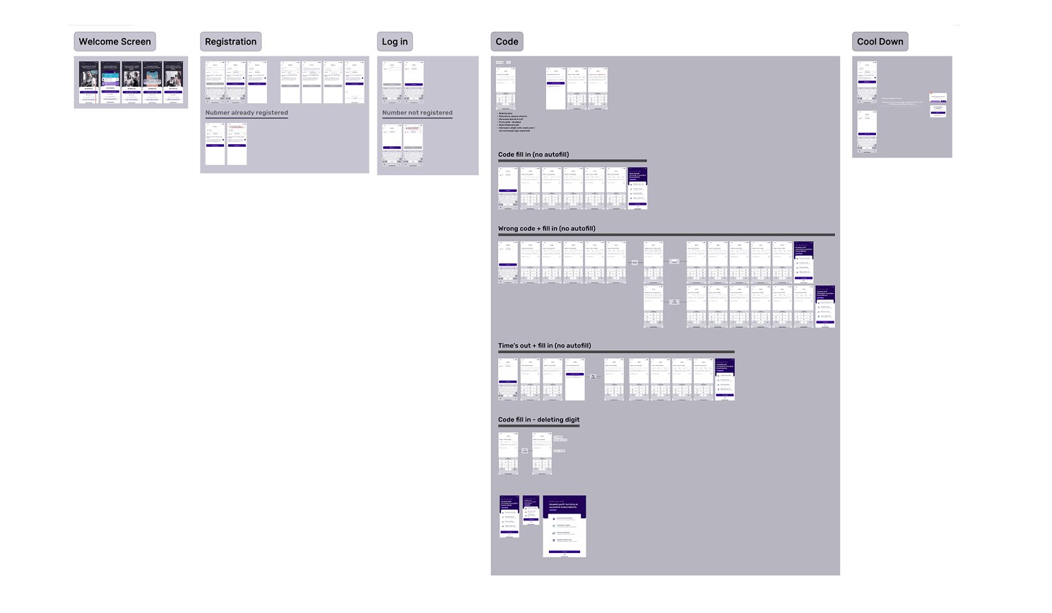
Full Design
The project file in Figma is well-organized with clear naming conventions and reusable components. All screens, interactions, and states are built with components and variants to ensure consistency and scalability across the app.
Tools
• Miro for planning and moodboarding
• Mockups for wireframing and first prototypes
• Figma for visual design and interaction design and final prototype
• Adobe Illustator and Photoshop for custom illustrations and photos
• ChatGPT for exploring copywriting
• Midjurney for exploring graphics and visual assets

